

There is a painting in the Rijksmuseum in Amsterdam that has stopped millions of people in their tracks. Not because it’s enormous. Not because it’s dramatic. It’s actually quite small, and almost nothing happens in it.
A woman stands at a window. She reads a letter. Light falls across her face from the left.
That’s it. That’s the whole painting.
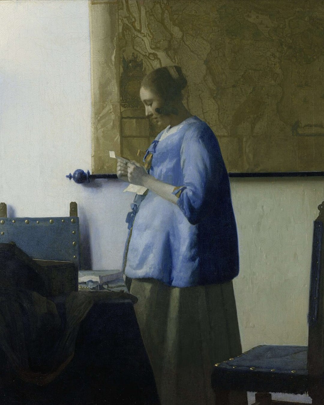
Johannes Vermeer completed Woman Reading a Letter around 1663. It has been hanging in various forms of reverence ever since. And if you showed it to someone who’d never heard of Vermeer — someone who only knew the internet — they might scroll past it in two seconds, or they might stop, unable to explain why.
I think the ones who stop are responding to something very old. Something that predates Instagram by about 360 years. And understanding what that something is — that’s the whole point of this newsletter.
A brief confession
I have spent years thinking about both art history and social media. Not always at the same time, and not always willingly. But somewhere along the way, I noticed something that I couldn’t un-notice:
The visual logic that made paintings last for centuries is the same visual logic that makes content stop thumbs in 2024.
This is either a profound insight or a mildly pretentious observation. Possibly both.
But stick with me.
When Vermeer placed his light source on the left, he wasn’t being arbitrary. He was working within a centuries-old European tradition of representing light as something sacred, directional, and revealing. The window wasn’t just a window — it was a visual argument: this moment matters. Pay attention here. 👀
When a photographer today chases the golden hour — that warm, low, sideways light in the hour after sunrise or before sunset — they are, knowingly or not, working within the same tradition. The light hitting a coffee cup at 7am. The shadows on a face at dusk. The way a single source makes everything look meaningful.
The algorithm didn’t invent golden hour content. Vermeer did. :)
Why this matters (more than you might think)
There’s a certain exhaustion that comes with thinking about social media professionally. The trends cycle faster than you can follow them. The metrics change. The platform that mattered last year has been replaced by one you hadn’t heard of the year before that.
And yet — here’s the strange thing — the images that actually work tend to share something. A quality of light. A compositional logic. A way of drawing the eye. A sense that the person who made it understood something about looking that most people don’t articulate.
That understanding didn’t come from analytics. It came from somewhere much older.
Art history is, at its core, the study of why certain images hold attention across time. Why certain visual choices feel resonant while others feel flat. Why some compositions create tension and others create calm. Why some colors make us uneasy while others feel like coming home.
These aren’t soft, subjective impressions. They’re documented, debated, and surprisingly consistent across cultures and centuries. The golden ratio keeps showing up. Diagonal lines keep creating dynamism. Empty space keeps feeling like either peace or loneliness, depending on what surrounds it.
We have thousands of years of visual culture showing what human attention responds to. And most social media advice ignores every single year of it.
What this newsletter is
Every few weeks, I’ll take a concept from art history and follow it somewhere unexpected. 🔍
Sometimes that place is Instagram. Sometimes it’s a music video, an album cover, or a film still. Sometimes it’s a meme format that’s been running for three years and, on closer inspection, turns out to be a direct descendant of 16th century Dutch genre painting. (That one’s coming. I’m still recovering from discovering it.)
The essays will not be academic in the sense of being difficult. They will be academic in the sense of taking things seriously.
They will also, I hope, be fun.
Because there is something genuinely delightful about discovering that Taylor Swift’s visual era for a particular album is essentially a Rococo painting come to life. Or that the reason a certain type of minimalist brand photography feels expensive is because it’s borrowing the compositional logic of 17th century still lifes. Or that the TikTok trend you watched seventeen times last week is, structurally, a vanitas.
Art history is not a museum. It’s a toolkit.
And once you start seeing it, you can’t stop.
A word about the title
This newsletter is called Gilt & Grid.
“Gilt” as in the gold leaf on an old picture frame. “Grid” as in the layout you’re staring at right now. The name is the argument: these two things belong in the same sentence.
Whatever we end up doing here, the premise is the same: take the long view. Not because the past is more important than the present — it isn’t, particularly — but because the past is where we can see our own habits most clearly.
We are not as new as we think we are.
Our obsession with light, with framing, with what to show and what to hide, with the look that says I have a life worth looking at — none of that started with the front-facing camera. It started much earlier. In Flemish studios. In Italian piazzas. In the careful, calculating mind of every artist who ever thought:
How do I make someone stop and look?
That question is as old as human image-making. It’s also the question every content creator, every brand strategist, every museum social media manager, and every person who’s ever retaken a photo seventeen times is quietly asking.
This newsletter is about the answer — or at least, about following the question somewhere interesting.
What’s coming next
The next essay is about Vermeer specifically — about his light, and what it actually means when your phone camera hunts for that same quality on a Tuesday morning. We’ll talk about the Camera Obscura (yes, Vermeer possibly used one — the 17th century version of a filter), about what “natural light” really means as a visual code, and about why golden hour content works neurologically, culturally, and historically all at once.
After that: Mondrian. Grid systems. Instagram layouts. A visual argument about why order feels like authority and chaos feels like personality, and how you can use both intentionally.
And then, because I cannot help myself: the Baroque. Emotion as spectacle. Drama as design. A certain pop star who understood this completely.
If any of this sounds like your kind of thing — welcome. 💜
If you’re skeptical that a 17th century Dutch painter has anything useful to say about your content strategy: good. Skepticism is the correct starting position. Stay anyway. I promise Vermeer will win you over. :)
He’s had a few hundred years of practice.

Grazie 1000
Amazing amazing point of observing and appreciate our past.
But 🚨
How can we go a step ahead in time?
Shouldn‘t we continue our journey of development in life?
Thank you Kathleen
Great perspective and an important subject.